

Context
During my UX/UI internship at Jam BC, one of their clients was Clinova Ltd, a UK-based healthcare company. One of their products is Caidr, a digital healthcare app that helps you assess common medical symptoms.
Project Brief
During my UX/UI internship at Jam BC, one of their clients was Clinova Ltd, a UK-based healthcare company. One of their products is Caidr, a digital healthcare app that helps you assess common medical symptoms.
Timeline
1 month
Category
UX Design
Project type
Native mobile application
Role on the project
Information architecture, user research and user testing, ideation, wireframes, prototypes, usability testing
Tools used
Pen and paper, Miro, Axure RP
THE PROBLEM
Receiving the symptom assessment for users of the app is a cumbersome and unpleasant process
The Caidr project presented a pressing challenge: users encountered a cumbersome and frustrating experience while seeking symptom assessments and treatment options. My goal was to tackle these usability issues and deliver a streamlined and intuitive digital healthcare app. The aim was to empower users by providing them with a seamless and efficient platform to navigate their medical concerns and make informed decisions about their health.
THE SOLUTION

Easily find all of the provided services
-
All available services clearly displayed for easy access
-
Prominently featured assessment to guide users towards the core functionality of the app
-
Intuitive navigation and search functionality for quick access to services based on user needs
Questions simplified
-
Clear question layout with distinct answer options
-
Easy option to navigate back and edit answers
-
Intuitive interaction flow for enhanced user engagement with minimal cognitive load


Learn all about your condition in minutes
-
A comprehensive database of user-relevant information
-
Clear explanations of medical terminology to aid users
-
User-friendly navigation for quick access to desired information, facilitating rapid learning about their condition
Find the treatment now
-
Caidr-recommended products tailored to users' conditions
-
Access to vendors for easy purchase of treatments
-
Choice of treatment method: home delivery or nearby stores
-
Additional assistance through similar product suggestions for alternative options meeting specific needs


Research
RESEARCH & METHODOLOGIES
To understand the problem and learn more about Caidr and its users, I needed to focus on research goals and create questions that would help me achieve those. I decided to detail the methodologies I’d use to help me gather information.
Research Goals
-
Learn more about the target user demographic
-
Learn users' core motivations, goals, needs and frustrations when navigating the app
-
Learn more about the current competition, their strengths and weaknesses
-
Learn how Caidr users experience the current version of the app, especially the symptom assessment
Research Methodologies
-
Surveys and setting up user criteria
-
Competitor Analysis
-
User testing, paired up with contextual interviews
SURVEYS & USER CRITERIA
Caidr users were dissatisfied with the Assessment journey, while the Results page lacked functionality
The initial research was carried out by the Caidr marketing team, using a simple survey. The results gave me a great insight into the Caidr user demographic, shown on the below:
Age
Female: 18 - 54
Male: 18 - 24
Sex
62% Female
38% Male
18+ in household
1 - 2
Dependants in household
0 - 2
Household income
£12k - £40k
Satisfaction level with the question pathway to get the assessment
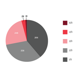
Satisfaction level with the assessment results page

COMPETITOR ANALYSIS
We identified a business opportunity: our direct competitors didn't provide treatment solutions
For the competitive analysis, I examined competitors like WebMD, Medscape, and Ada, focusing on their health check delivery and solutions. These competitors don't offer treatment solutions after providing health diagnoses. However, Babylon, an indirect competitor with virtual healthcare services, offers a prescription delivery option. Taking inspiration from Babylon and e-commerce platforms like Amazon and eBay, I aimed to provide fast treatment solutions.


Strengths
-
User-friendly interface
-
Accurate and extensive condition library
-
Diverse media content throughout the app
Weaknesses
-
Lack of personalisation
-
Overwhelming amount of information
-
Overemphasis on advertisements


Strengths
-
Credible drug database
-
Catered to various medical professionals
-
Regular news and research updates
Weaknesses
-
Restricted access for non-professionals
-
Complex user interface
-
Overemphasis on advertisements


Strengths
-
User-friendly interface
-
Virtual access to doctor consultations
-
Prescription delivery service
Weaknesses
-
Reliance on a stable internet connection
-
Lack of physical examinations
-
AI-based potential diagnosis limitations


Strengths
-
User-friendly interface
-
High accessibility standards
-
Medical history records
Weaknesses
-
Lack of immediate response to illness
-
Lack of interaction with professionals
-
Potential overreliance on self-diagnosis
USER TESTING AND CONTEXTUAL INTERVIEWS
Participants expressed frustrations regarding the user journey of the healthcare assessment
After analysing Caidr's surveys and conducting a competitive analysis, I made assumptions about the app's downfalls. To validate these, I tested the current Caidr app with 5 participants matching the demographic. Later, I mapped potential problem themes on an Affinity map.

Research Questions
-
Have you previously used virtual means of getting a healthcare diagnosis?
-
How would you describe your experience navigating the healthcare assessment?
-
What difficulties did you encounter when answering the assessment questions?
-
How satisfied are you with the results provided by the assessment?
-
What did you think about the treatment options provided?
-
How likely are you to trust and rely on the assessment results?
-
What did you think of the language and terminology used within the application?
-
What did you think about the visual identity of the application?


Define
MAIN INSIGHTS
Based on the trending themes in my Affinity map, I was able to identify the three main themes that helped me better understand Caidr's users, shown below:
Difficulty Answering Questions
-
Some users struggled to access their previously answered questions
-
Users were frustrated over a feeling of lack of progression when progressing through the question pathway
Lack of Substantial Treatments
-
Some users couldn't purchase certain treatments directly in the app but couldn't
-
Some users were frustrated over their potential time being wasted, due to Caidr's failure to assess their symptoms
The Credibility of the Assessment
-
Some users felt the information was lacking on the result page
-
Difficulty navigating through the assessment results
USER PERSONAS
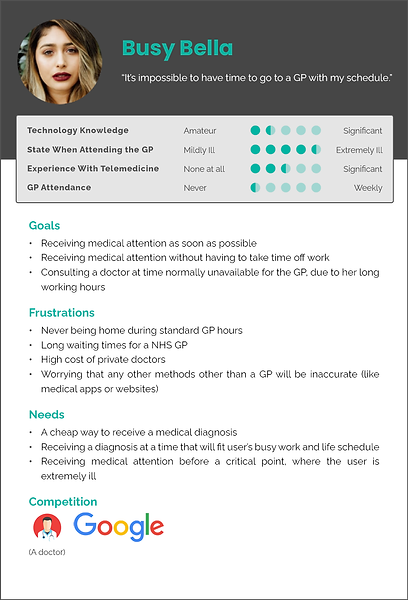
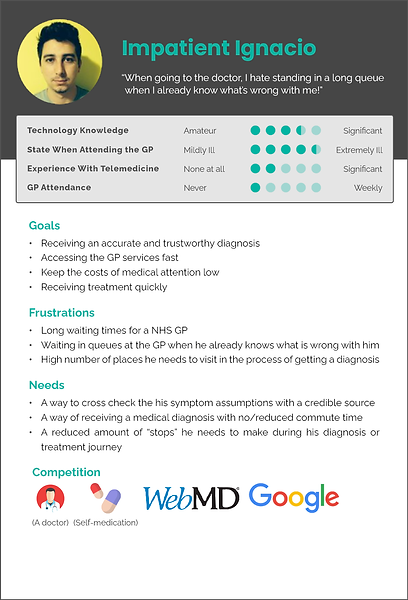
By examining the research data, I created user personas to guide my design choices. Busy Bella and Impatient Ignacio embody the user characteristics and informed my decisions throughout the design process.
DEFINING THE PROBLEM
A person displaying illness symptoms who feels uncertain about the cause and state of their condition needs a way to find treatment quickly and easily
After synthesising my research, I concluded that my assumptions were somewhat accurate. However, by understanding my users' needs and goals, I identified the most prominent issue with Caidr's current version: the lack of substantial treatment options.


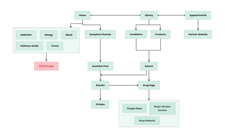
USER FLOWS
With my sketches ready, I built new user flows for Caidr. Certain parts of the app are beyond this project's scope, but Caidr asked they were considered in the redesign.

Prototype
WIREFRAMES
Prioritising business objectives and medicine vendor partners, I integrated treatment options into the assessment results screen
To create wireframes, I learned Axure RP through online tutorials and continued learning while building the prototype.
Balancing business priorities and user needs, I integrated treatment options into the condition results screen of a healthcare application. This decision significantly improved the usability of the platform, facilitating better decision-making for users.

PROTOTYPE CONCEPTS
Using Axure RP, I created three concept prototypes. Being new to prototyping software, I soon realised the limitations of Axure. The initial design proved too complex for a smoothly working prototype, which could negatively impact usability scores during testing. After review, I built the three screens shown below, along with their respective prototypes.
-
In prototype A, I improved access to the symptom checker with a noticeable CTA, drawing users' attention. I also introduced swipeable cards on the top side of the screen, displaying common searches for quick searchability and easy readability. Unnecessary clutter was removed, pushing other sections below the fold
-
Prototype B aimed to present as many sections as possible on each page with minimal cognitive strain. Icons familiarised users with each concept, and clean lines and shadows highlighted content.
-
Finally, in prototype C, I combined elements from both designs, emphasising the user interface and visual images. I also wanted to observe if UI styling changes could somehow influence users' scores


Test
USABILITY TESTING
We used observations and contextual inquiries, along with
A/B testing to validate the solutions
While the Clinova team tested the app with friends and family, observing their reactions and answering a feedback questionnaire, I decided to carry out contextual inquiries and A/B testing. My aim for these were as follows:
-
To observe first impressions of each respective screen in each prototype
-
To assess and observe pain points users might experience while interacting with the prototypes
-
To test which UI patterns are the most user-friendly to Caidr users
-
To assess feelings users feel when they complete an assessment
CONTEXTUAL INQUIRIES & A/B TESTING
Users felt an overall better user experience when the process was faster, utilising quick access to the symptom assessment and the assessment results


Success Rate
Ease of Use
Satisfaction
Home Screen
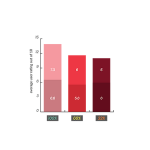
Question Pathway
Success Rate
Ease of Use
Satisfaction

Iterate
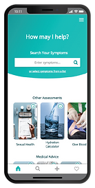
FINAL UX DESIGN
To optimise the symptom assessment journey, I combined the most successful parts of each prototype
Based on the testing data, I merged the highest-scoring features to create the final prototype. This involved adding the symptom checker on the home screen for easy access to assessments, improving the question pathway flow and styling, and enhancing the results page with an extensive condition database and treatment options available for purchase. Below, I outlined the changes made on each screen and showed the original Caidr app, as well as my improved designs.
Improved Assessment Engagement with Streamlined Navigation
The home screen focused on a visually appealing and uncluttered design, strategically placing the assessment option as a prominent feature. This highlighted its significance and guided users towards the app's core functionality. Furthermore, intuitive navigation and search functionality allowed easy access to needed services, enhancing the overall user experience.


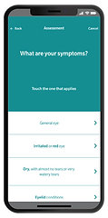

Simplified Question Pathway Journey
For the question pathway screen, I prioritised a clear and intuitive layout, enabling users to navigate and edit answers effortlessly. This ensured a seamless interaction flow with minimal cognitive load.
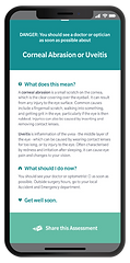
Enhanced Medical Information Visualisation
On the results page, I integrated the existing Caidr database, presenting information about medical conditions in a user-friendly manner, with visual aids for better understanding.

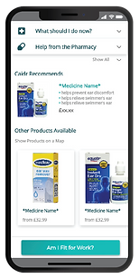

Streamlined Treatment Options with Caidr Recommendations and Products
To facilitate finding treatment, I implemented Caidr-recommended products and access to vendors offering home delivery or nearby store options. Additional support was provided with similar product suggestions to cater to users' specific needs.

FINAL UI DESIGN
During the project, I focused on UX while a visual designer, Charlotte, handled the UI re-branding for Caidr. When Clinova decided to proceed with UI design before conducting usability testing, I handed over the screens to Charlotte. She designed the user interface for Caidr 2.0, which unfortunately changed the UX. Although no longer working for Clinova, I expressed concerns about the app changes. The new home screen functionality made it harder for users to choose options, button placement and sizing created usability issues, while bold shadows and striking colours caused accessibility issues. Despite my concerns, the company launched the new version as designed by Charlotte, and the app was released shortly after.


FUTURE CONSIDERATIONS

Further Quant and Qual Research
In future projects, I'll prioritise obtaining higher-quality research data. I'll include metrics like task completion time, error rate, and SMEQ (Subjective Mental Effort Questions) alongside user-scored metrics. This comprehensive approach will provide insights for evaluating and determining the optimal design, leading to more informed decisions.
Feature Matrix
From the beginning, the CEO of Clinova had a clear idea of the app's desired features. As the project progressed, the feature list expanded beyond the original scope. In future projects with separate features, I would use a feature matrix to prioritise key features for the initial launch. Less essential features could be divided across future product roll-outs.

Iteration and New Features
I saw the potential for more iteration and new features. For example, exploring the "question history" functionality and allowing better access to previously answered questions, would have enhanced the overall user experience and satisfaction with the app. Therefore, further iterations could have uncovered additional pain points and valuable insights.
More Robust Prototype and More Experience
During the project, I used Axure RP for the first time as my prototyping software. However, I faced some limitations that hindered my progress. In the future, learning other prototyping tools like Adobe XD, Sketch, or Figma would be beneficial. Expanding my toolkit and familiarity with these tools will enable me to create more robust prototypes and deliver great products.