

Context
Everyone goes through the process of moving houses at some point in life, particularly in London. However, my experiences with widely used tools like Spareroom made me realise they lacked user-friendliness. With guidance from my mentor, I decided to redesign the Spareroom platform collaboratively, prioritising its users' needs.
Project Brief
Find and analyse pain points with the current application and website and redesign the user experience accordingly.
Timeline
2 months
Category
UX Design
Project type
Native mobile application
Role on the project
Information architecture, user research and user testing, ideation, wireframes, prototypes, usability testing
Tools used
Pen and paper, Miro, Figma
THE PROBLEM
Renters face time consuming property searches, often find undesirable properties and struggle to find relevant amenities nearby in the process
The Spareroom project aimed to address a pressing challenge: users faced a cumbersome and frustrating experience seeking symptom assessments and treatment options. Our goal was to create a streamlined and intuitive digital healthcare app, empowering users with efficient navigation for their medical concerns and informed health decisions.
THE SOLUTION
Check each listing directly on the map
-
Efficient map exploration of multiple properties
-
Immediate access to images for each property
-
Convenient access to key property details
-
Saved time by quickly ruling out undesirable properties


View through property images faster
-
Improved image-viewing navigation
-
Image descriptions for quick property evaluation
-
Saved time by scanning through property image thumbnails
Explore the local area better
-
Walking distance indicator for the current search area
-
Valuable local area context feature
-
Proximity insights to nearby amenities


Change your search area on-the-go
-
One-swipe search location change
-
Saved time by modifying the search distance on the map
-
User-friendly map-based controls for a smoother and intuitive search experience


Research
RESEARCH & METHODOLOGIES
To understand the problem and learn more about Spareroom and its users, we needed to focus on research goals and create questions that would help us achieve those. I decided to detail the methodologies I’d use to help me gather information.
Research Goals
-
Learn more about the target user demographic
-
Learn users' core motivations, goals, needs and frustrations when navigating the app
-
Learn more about the current competition, their strengths and weaknesses
-
Learn how Spareroom users experience the current version of the app
Research Methodologies
-
Surveys and setting up user criteria
-
User testing, paired up with contextual interviews
-
Competitor Analysis
-
Competitor Feature Analysis
SURVEYS & USER CRITERIA
Target users value public transport, and they tend to use the mobile view to search for flats. However, due to the mobile view's reduced functionality, they prefer the desktop view
To understand flat-searching app users like Spareroom, I recruited participants through word-of-mouth. The criteria and sample survey questions were as follows:
Age
25+
Sex
Male and Female
Frequency of searching for a place
Once a year
Most important amenity
Public Transport
Commonly searching where?
At home

In the process of searching for a place, rank the following options in terms of the importance of close proximity to your new place.

Which device do you use to search for a place?

Which is your preferred device to search for a place?
USER TESTING AND CONTEXTUAL INTERVIEWS
Participants expressed frustrations regarding the limited functionality of viewing property images quickly
After analysing Spareroom surveys, I carried out user testing with 6 participants from the target demographic. This helped validate my assumptions about platform drawbacks. With my mentor's guidance, I created an Affinity map to identify problem themes.

Research Questions
-
How would you describe your experience navigating the website or application?
-
What information are you looking out for when searching for a house?
-
What is the deciding factor in choosing houses for you?
-
What difficulties did you encounter when searching for a house?
-
What information does the map show you?
-
How satisfied are you with the functionality of the list view?
-
How satisfied are you with the functionality of the map view?
-
What did you think of the search tools provided by Spareroom?
-
What makes you trust a property listing owner?
-
What did you think about the visual identity of the application?
.png)
COMPETITOR ANALYSIS
On their mobile counterpart, direct competitors don't offer an intuitive property image-viewing experience
During the competitive analysis, we assessed how competitors handled house searching on desktop and mobile. They targeted different demographics: Rightmove and Zoopla focused on homebuyers, while OpenRent and Spareroom targeted renters. Their desktop strengths didn't always translate to mobile. OpenRent lacked a dedicated app, and Rightmove and Zoopla's mobile experiences needed improvement.


Strengths
-
User-friendly desktop interface
-
Powerful map tool
-
Advanced filtering
-
Integration of school ratings and public transportation links
Weaknesses
-
Limited rooms for rent
-
High presence of listings, not suitable for individual renters
-
Navigation and user experience could be further improved


Strengths
-
User-friendly desktop interface
-
Direct communication with landlords
-
Transparent pricing
-
Tenant verification and referencing process
Weaknesses
-
Limited inventory
-
Inconsistent listing quality
-
Lack of integration with local amenities
-
Less coverage in certain regions

Strengths
-
Advanced search options
-
Integration with local amenities, property value estimates etc
-
Transparency through agent reviews
Weaknesses
-
Limited rooms for rent
-
User interface could be more intuitive
-
Overwhelming amount of info on listing pages
-
Less coverage in certain regions
COMPETITOR FEATURE ANALYSIS
To move the project forward, we carried out a competitive feature analysis, with a focus on property image viewing, map functionality, property list view behaviour, mass house-searching, and access to local amenity information.

We noticed competitors only provide public transport info once users enter a property listing page. Understanding the importance of image viewing in users' decision-making process, we improved the experience. User testing showed that browsing property images without entering the listing page significantly enhanced speed and efficiency. This gave us the opportunity to set Spareroom apart from competitors, who lacked the same level of mobile functionality. We better met our users' needs this way.

Define
MAIN INSIGHTS
Based on the trending themes in the Affinity map, we were able to identify the three main themes that helped us better understand Spareroom's users, shown below:
Viewing Property Images as a Priority
-
Some users check pictures of the property first, as their search parameters are already set
-
Frustration over lack of ability to instantly view property images
Functionality That Supports Mass-searching
-
Some users felt the app experience is inefficient when searching through a multitude of properties
-
Frustration over wasted time, each time a user rejects a property
Understanding the Proximity to Local Amenities
-
Some users prioritised properties with better access to public transport
-
Frustration over lack of public transport information early on
-
Confusion over not understanding the proximity of the newly searched area
USER PERSONAS
By looking at similarities in data from the research, I developed user personas that would help inform our decisions throughout the design process. Visual Vlad and Proximous Petra would represent my users' characteristics and inform our design decisions.


DEFINING THE PROBLEM
Renters searching for a new place, need a way to scan through properties faster and a clearer map function so that they can find properties with access to close amenities
Upon synthesising the research, we found our assumptions were somewhat accurate. Users favoured mobile devices due to ease of use and mobility. Understanding their needs, we identified key issues: poor property image-viewing experience and limited local area information on Spareroom's platform. To address this, we narrowed the project's scope, focusing on only enhancing the mobile experience, as our competitors lacked in this area.


USER FLOWS
With my sketches prepared, I crafted new user flows for Spareroom. I focused on streamlining the map tool's functionality, improving image viewing experience, and providing easy access to full and updated property information. Additionally, I introduced infographics on non-product listing pages to enhance the presentation of property details.


Prototype
WIREFRAMES
Utilising Figma and the Spareroom brand guidelines, I created a prototype featuring multiple iterations of selected screens
Once I knew what I needed to create, I decided to enhance my skills in Figma and began building the Spareroom mobile app wireframes and prototypes. To maintain consistency, I reviewed the app's overall look, UI, design system, and information architecture. Integrating elements with the existing interface was the main challenge. Here are the concepts I developed:
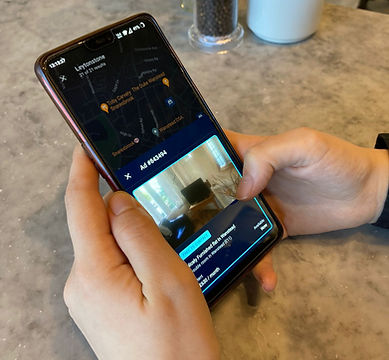
Quick Access to Property Details and Images from the Map
Below, you'll find Spareroom's current pull-up drawer and my redesigned versions. Users needed quick image access without going to the listing page. For A/B testing, I created two concepts with carousel image behaviour and infographics including four vital data points, ie: the distance to public transport. The proposed drawer can expand to a full listing page for an enhanced experience.


Map Tools and Local Amenities
In the map view, users found changing the location in the current Spareroom app counterintuitive. To improve this, I added area controls on the map, enabling easy location and radius changes. I also included a radar at closer zoom levels, showing a ten-minute walking distance radius, along with existing amenity markers. This helps users understand the explored area and local amenities better.


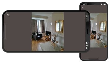
Improved Image Gallery Experience
Below, you'll find the current image gallery layouts for Spareroom and my redesigned version. To enhance image viewing, I introduced an image counter and an additional navigation panel for smooth image browsing. Users can now scan images without the need to click on each one. Furthermore, I included image descriptions to offer clarity and improve user understanding.

Revised Property information
Below, you'll find the current search results and product listing page layouts and my redesigned versions. I added vital data points with infographics for easy information scanning, reducing steps for users to check a property. For the list view, I included an image carousel with an image counter for quick image browsing. I also reorganised the Hide/Share/Save Ad buttons on the product listing page for better accessibility and coherence.


PROTOTYPE
The next step involved building the prototype, combining existing Spareroom screens with new features. The aim was to test functionality and identify potential usability issues as participants completed assigned tasks.


Test
USABILITY AND A/B TESTING
Users expressed their preference for the concept solution which prioritised the quality of viewing property images


The usability tests involved remote moderated "think aloud" sessions with 6 Spareroom app familiar participants. Each participant did contextual inquiries and A/B testing of 2 prototype concepts. Success was measured by task completion, minimal errors, and promptness. Furthermore, I gathered insights on the user experience through additional methods:
-
Observed first impressions of each respective screen in each prototype
-
Discovered pain points users might experience while interacting with the prototypes
-
Examined feelings users feel when they stumble across a usability issue
-
Assessed feelings users feel as they explore new app functionality
-
Tested which UI patterns are the most user-friendly to Spareroom users
FINDINGS

Frequency of Future Use

Ease of Use

Recommendation

Iterate
FINAL UX DESIGN
With the aid of easy access to property images, we streamlined the process of viewing multiple properties and achieved a more focused and intuitive user experience
After user testing, we chose the concept with a pull-up drawer containing revised property info and a full-width image gallery. Users preferred the screen-width version as it showed more of the property without clicking, making the journey faster and less intrusive. This improved the user experience when scanning through multiple houses.
Lastly, I added new functionality to centre the map around the viewed property's marker and tags like "New Today" or "Upgrade to Contact" on listings and moved image descriptions for better context. These enhancements ensured a focused and intuitive experience.
FUTURE CONSIDERATIONS

Functionality and Controls
Ease of use rating for functionality and controls needed improvement during testing, as some users found certain features unclear. To address this, I plan to explore Spareroom's "Search here" feature to enhance my design and resolve these issues. I created a quick mock-up to showcase this idea.

User Interface and Infographic Elements
During testing, we identified UI improvement areas. Though beyond the project's scope, I would iterate on information presentation using text and infographics. Conducting more testing sessions would also reveal further UI insights and address usability issues.

New User Onboarding
Users initially struggled with certain features but improved their proficiency through prototype exploration. This highlighted the importance of onboarding and user engagement. In the future, I plan to conduct A/B testing to determine the best approach for introducing unfamiliar features to users.

Further Testing and Iteration
Testing remains essential for enhancing the product. Increasing the user pool and continuous iteration would greatly benefit the project, revealing additional issues.